

In the words of Soul II Soul ‘back to life, back to reality’ after a wonderful first-time trip to New York City last week, I’m back to the office and now all I want to do is talk about it! I drank in the beautiful surroundings (cocktails) and architecture and below documents my design highlights of one of the best cities I’ve ever visited.
I was lucky enough to eat at some of the most wonderful restaurants which boasted the most uniquely designed interiors. The New Yorker’s do not scrimp on an interior and boy-oh-boy my little eyes were feasting on the surroundings just as much as the frankly outstanding food, not to mention some of the celebrity clientele! I’m unashamed to admit the appearance of Justin Timberlake at the Meatpacking District’s Abe and Arthur’s, a few tables over from me somewhat ‘enhanced’ my enjoyment of a truly gorgeous establishment, designed perfectly in symbiosis with the iconic area it inhabits.

The Meatpacking District in New York is the equivalent (in feel and original purpose) of Smithfield’s Market here in London. In the 1900’s there were 250 slaughterhouses there – as you would expect from the name. As the century progressed the area took a decidedly seedy turn, but at the beginning of the 90’s those lovely fashion-designer types set up camp and the area started to become the uber trendy place it is today with some of the best concentration of restaurants and designer boutiques in the whole city.
The Meatpacking District combines the old architecture of the area, classic deep-red brick buildings, metal fire-escapes zigzagging across the huge windows and cobbled stoned streets with the achingly trendy, clean lines of the various shop fronts, new hotels and community buildings.

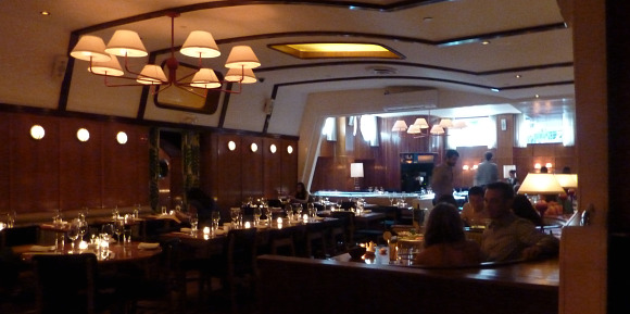
Abe and Arthur’s did not disappoint with it’s interior which echoed this complement of old and new inside. On the floor in the main bar were gorgeous white butcher shop tiles laid in a herringbone design which was a nice nod towards the origins of the area. Traditional dark wood panelling on the walls gave it a formality and intimacy, juxtaposed with modern orange-glow vertical lights and that great American-style long bar, backlit to perfection.

The main double level dining room was brighter, but not at the sacrifice of the ambiance but enough to appreciate the loveliness on your plate and with wall to ceiling glass with visible steel joists it gave an industrialised luxury feel. Light came pouring down from oversized paper-drums suspended from up high. We sat in a burnished orange-brown leather (naturally, it is a steakhouse after all!) booth, I loved the intimacy and comfort a booth provides (if given the choice I would choose a booth every time) and for some reason find myself feeling rather giddy in booths over tables and chairs! The lighting as well as the soft white tablecloths and swishy curtains upstairs helped to soften the hard edges of all that glass and steel. Abe and Arthur’s was a fabulous example of the delicate balance required in design, bringing in the right aesthetics to match the history of the area as well as creating the right atmosphere for the functionality of the venue.
Another notable interior on my trip was a fish restaurant called Lure in the very hip Soho, below Prada. You will notice a lot of my trip revolved around food, these aren’t restaurant reviews but a focus on the interiors – that would be a whole other blog! I have tried to make sure the interiors I mention are all unique in their own way and from each other…
The restaurant is barely visible from the outside, and entering down some steel steps straight away gives you the feeling that you are happening upon something a little special where only people in-the-know, know!
This interior I loved because, even though on a basic level it could be seen as “themed” the way this was executed was just exceptional and it was definitely more yacht than boat. You would think porthole style lights and hand-rails would look too obvious and pastiche for a fish restaurant but this place exuded class – once again the lighting was at the perfect level. Every detail “belonged” and had been carefully selected to work with the yacht-inspired concept. The walls were adorned with planks of a buffed-to-a-shine warm American Walnut, as was the bar itself.

We sat at the far end of the bar, which had a much more cosier feel from the main dining room. Like being ensconced in the warming hull of a luxurious liner, the ceiling was lower and the use of soft, tactile fabrics balanced out the heavy use of the wood and gave the restaurant a sense of depth as there was a different vibe from one part to the next, rather than one expanse of room.There was a soft tartan carpet and we sat on a deep turqouise velvet upholstered booth (a booth again, I was happy!), turquoise being a natural choice for the nautical without subscribing to the well-trotted out navy, white and red stripes.
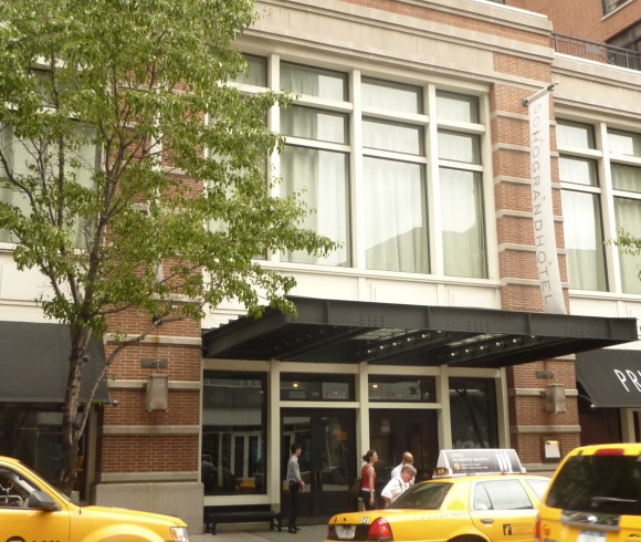
We stayed in the SoHo/ Greenwhich Village area of NYC which has a similar trendy vibe as Hoxton, North London but blended with the exclusivity of, say, Bond Street, rather than the “gritty” Old Street, a lovely combination I can assure you. The SoHo Grand Hotel was, as the name suggests, ‘Grand’ but it is also described as ‘Boutique’ and it seems to manage the impossible of straddling both concepts. It is in no means stuffy. The website describes the design concept thus “The hotel design’s permeating sense of sophistication is a signature trait of interior designer William Sofield of Studio Sofield, who created the clean, romantically eclectic space with one eye on the street and the other in the heavens”.

You can see what they mean, the materials used are plain to see; lot’s of exposed brickwork inside and out as well as smooth-as-silk concrete and wrought iron balustrades. This look is frequent in the more chic areas of NYC and is characterised by the more industrial-influenced modern style of architecture (exposed metal, simple and straight facades and lots of glass) seen throughout the city as a stark contrast to the early 20th century style of architecture which was heavily influenced by the ornate and romantic styles of ancient Greece and Rome (pillars, friezes and mouldings). Examples of which can be seen in the ornate exteriors and interiors of the famous Waldorf Astoria or Plaza Hotels featured in many-a late 80’s, early 90’s movie like “Scent of A Woman” starring Al Pacino. This architectural evolution was also depicted in the famous novel “The Fountain Head” by Ann Rand. Both styles are equally at home here.

The lobby had these fantastic floor to ceiling bird cages with bright azure blue and turquoise faux-birds in them which picked out the vibrant colours of the upholstery.
I could go on and on, The Guggenheim is well worth a visit if not for the contents of the questionable exhibition of “Modern Art” (read: a load of post-rationalised nonsense) but because it has the sexiest curves of any building in New York and beyond. Thai at Thomson Sixty is just the most sumptious combination of orientally influenced carved wood and the most stunning indoor water feature which is so still and smooth you have to touch it to check it’s not actually glass (well, I did but you’re not supposed to!).
So I went to New York and fell in love, I’m such a sucker for a good-looker, it was always going to end this way, ahh summer romances...